 Booth Design · CBE 2026
Booth Design · CBE 2026
Booth Design · CBE 2026
美 国 生 产 · CBE 上 海 2026
Sylvara Labs is a US-based contract manufacturer and private labeler across skincare and haircare, specializing in textured hair. Their first appearance at CBE Shanghai, Asia's largest beauty trade show, carried a real tension: the booth had to read as unmistakably Sylvara, yet feel native enough to draw Chinese buyers into conversation.
I worked directly with the client to turn that into a complete visual system: logo, palette, the back-wall key visual, signage, the booth architecture, and the print collateral, all anchored by one promise, from our lab to your label.
With tariffs reshaping beauty supply chains, a US-based manufacturer at a Chinese show is a rare thing. The booth had to get that across quickly: an FDA-compliant partner that makes things in America, not just another factory.
Two kinds of buyer. Brands that need US manufacturing to get around tariffs, and brands looking to enter the US market, including the $7.5B textured-hair category most of them have never touched. The booth had to talk to both.
品 牌 识 别
A lab that formulates for every hair texture needed an identity with the same range. Here is the logo, palette, type and voice that carries it.
Skincare · Haircare · Bodycare · Fragrance
色 彩 与 字 体
The palette is mostly sage and bone with a little antique gold. Clean enough to read as a US lab, warm enough to still feel like beauty. A high-contrast serif carries the name, and a quieter sans handles the bilingual labels.
标 志 系 统
The monogram is an "S" wrapped around a single leaf, paired with a Trajan-style wordmark. It works at booth-banner size and on a business card, and reverses to white cleanly for the green walls.
 MonogramReversed · dark field
两 个 市 场 · 一 个 方 案
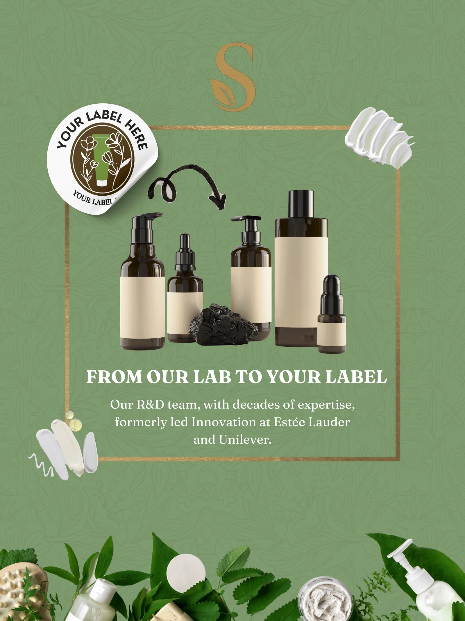
The back wall puts three women, three hair textures, in gold frames against botanical green: skincare, haircare, bodycare, fragrance. The point lands without a caption. This is a lab that formulates for everyone.
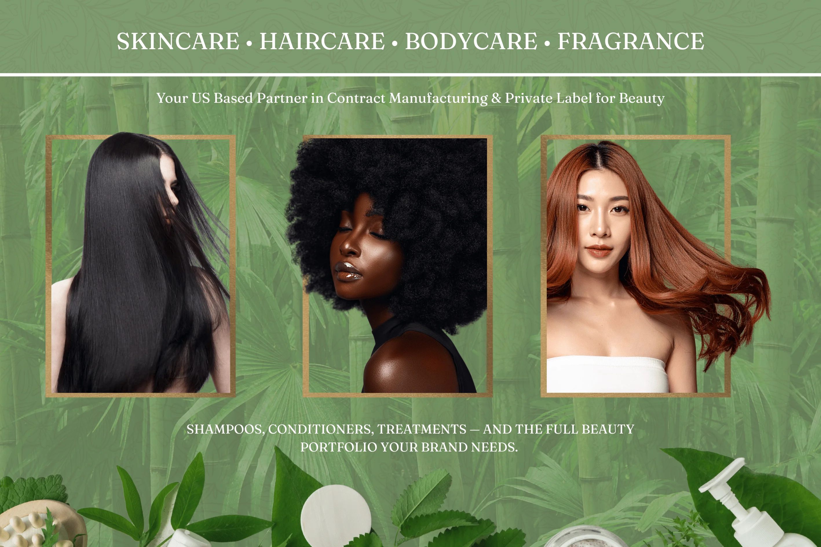 Fig. 01 · Back panel
展 位 · 设 计
From render to spec to the finished corner shell on the CBE floor, plus the print collateral that went home in buyers' hands.
展 位 · 设 计
Every surface was treated as part of one system: the lit header crown, the back-wall key visual, the private-label panel, and a cream reception counter with the monogram on the front. The render set the look, and the spec drawing sized each poster down to the millimetre.
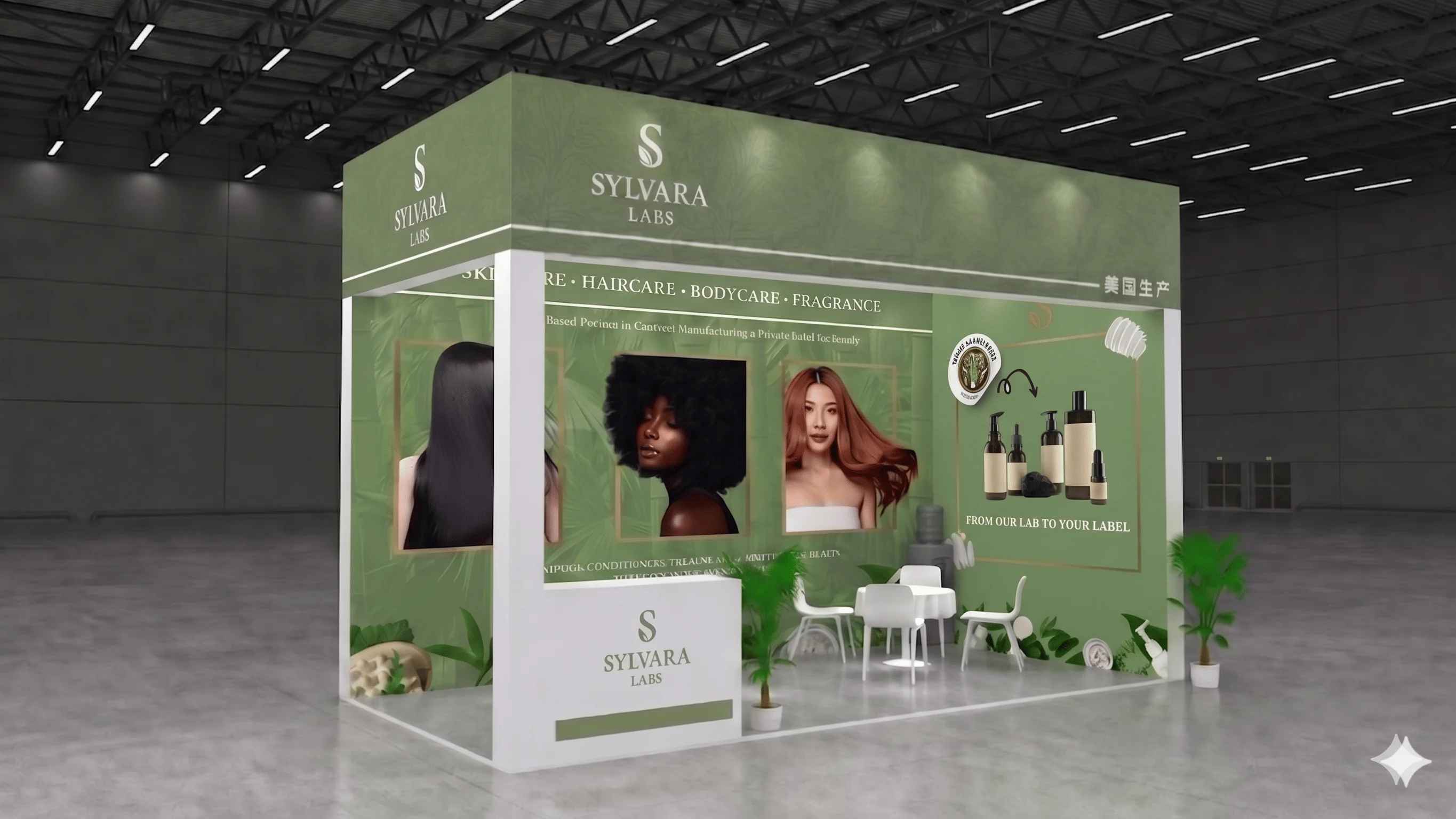 Design intent · E2M15
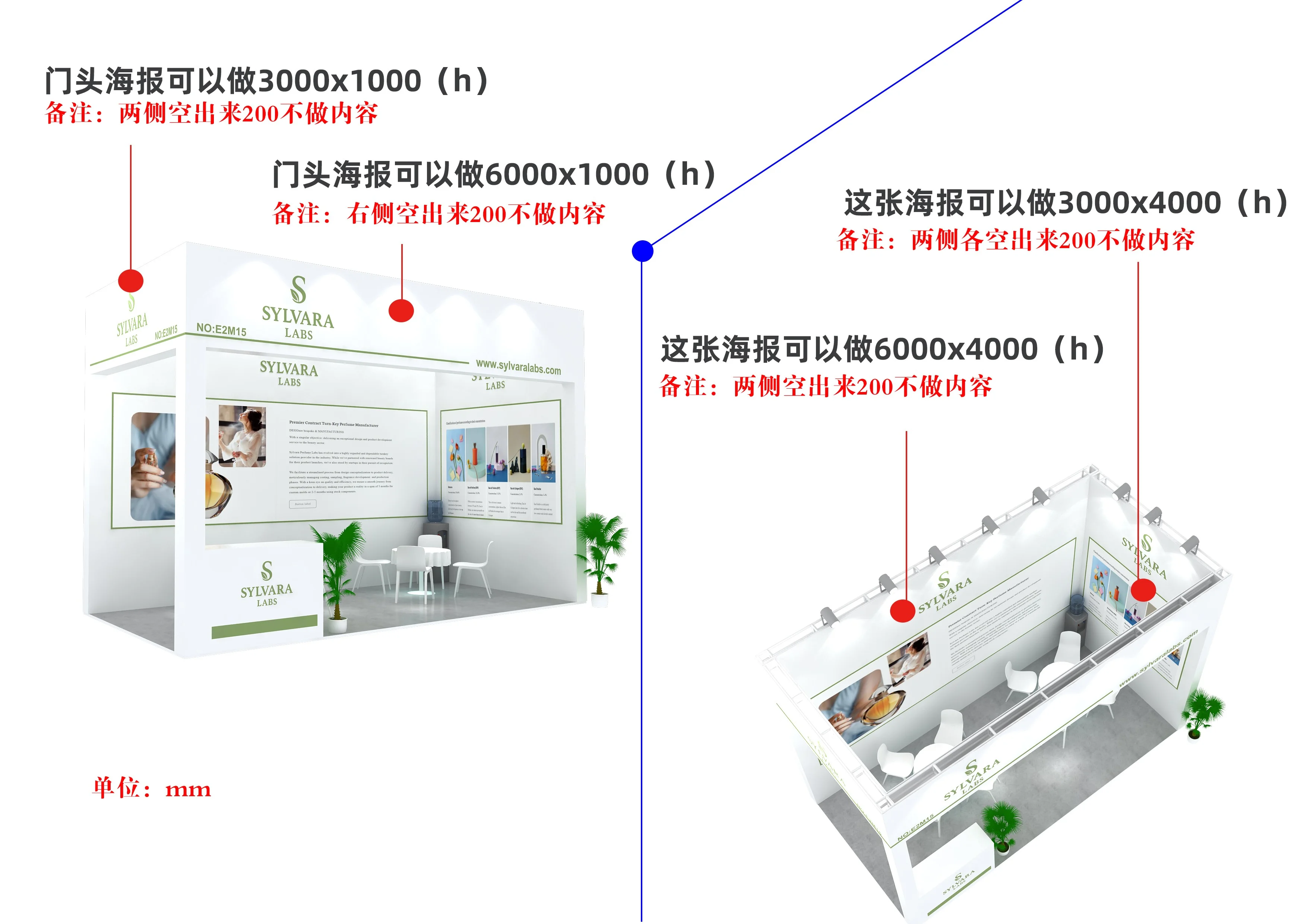 Fig. 02 · Poster spec · sizes in mm

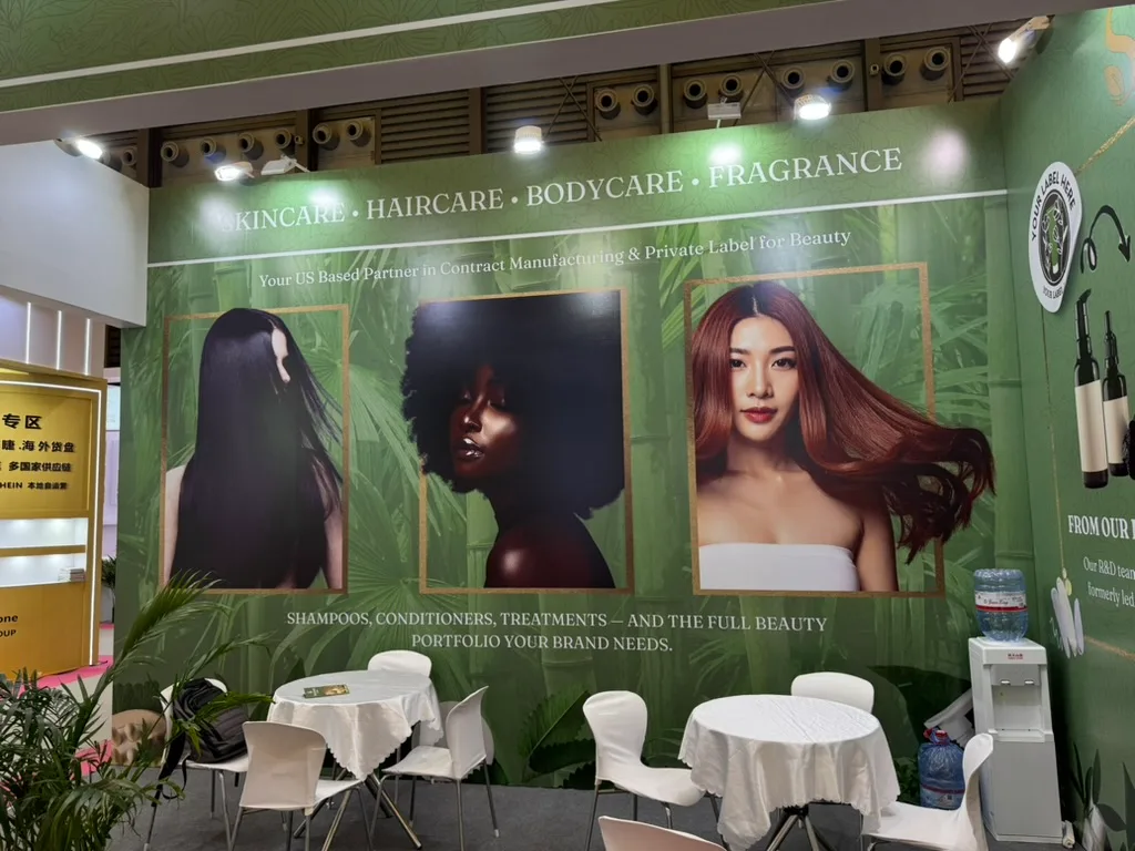 Back wall · key visual & seating
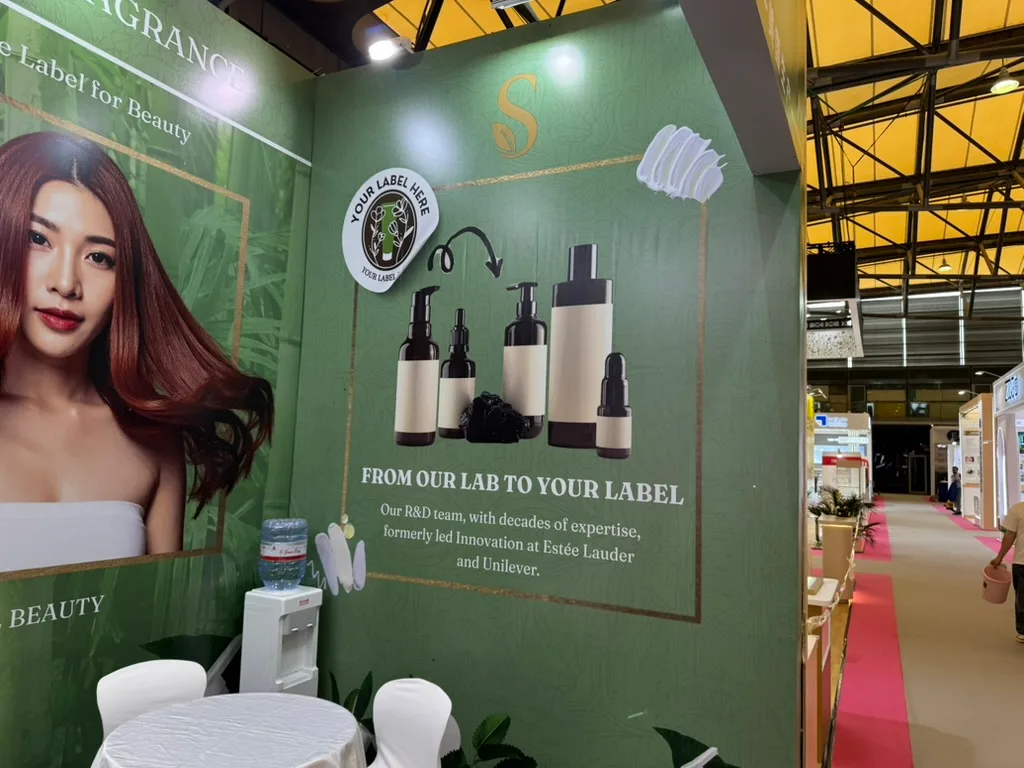 Side wall · "your label here"
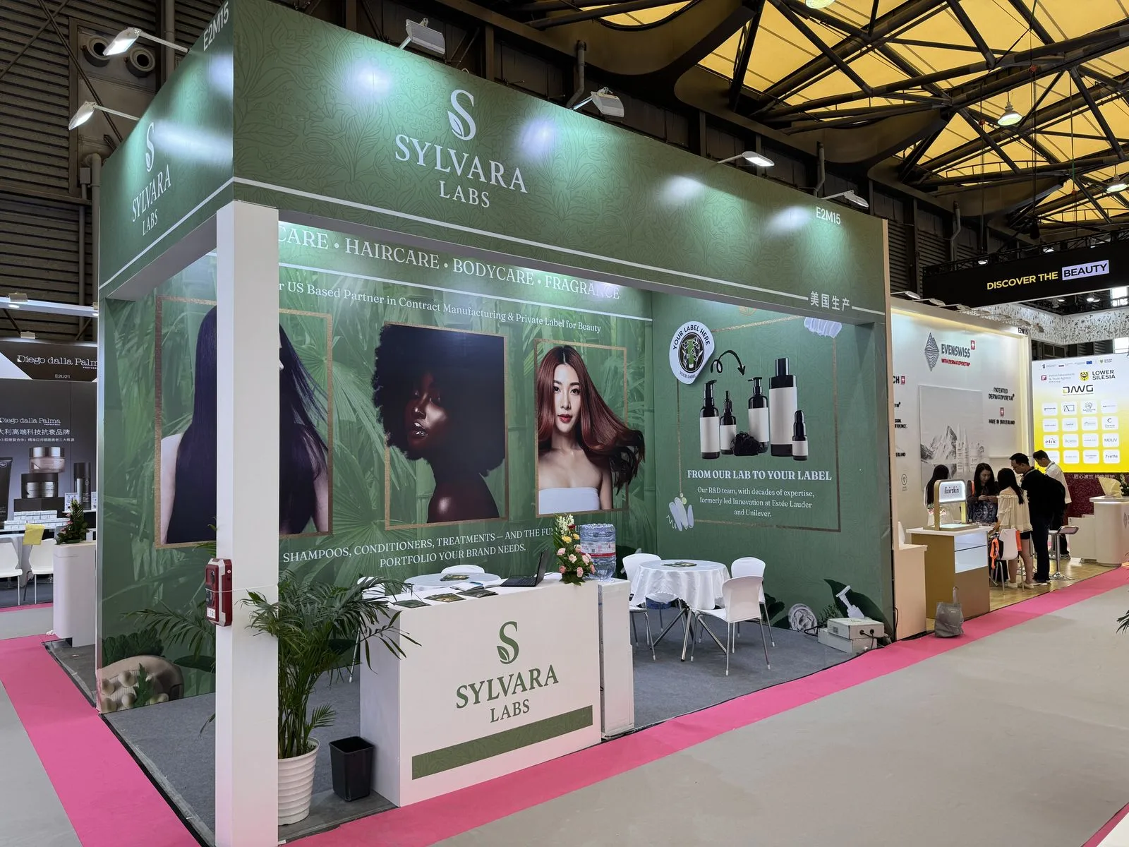 As built · stand E2M15
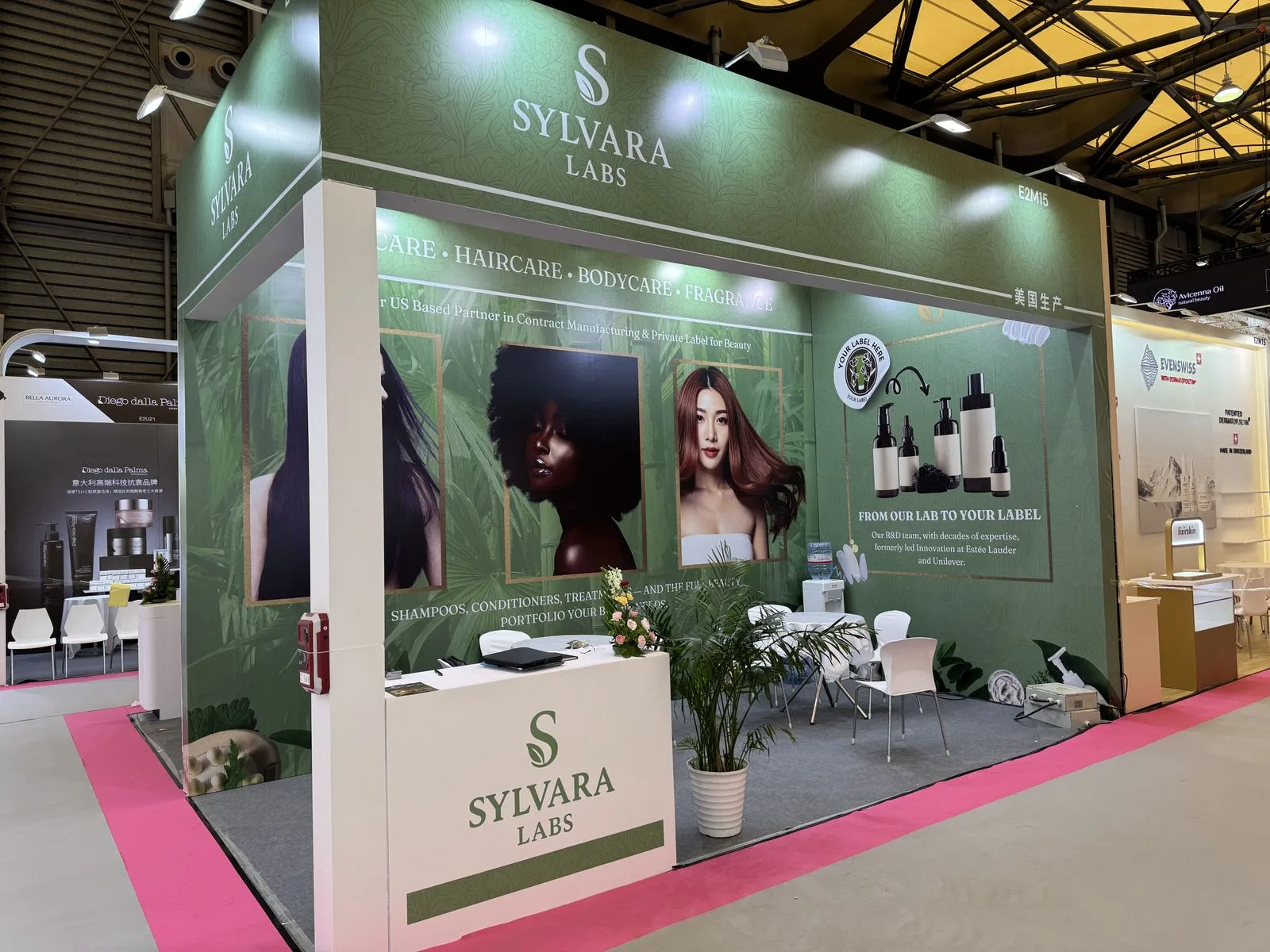 On the floor · side angle
宣 传 物 料
A tri-fold brochure and a business card take the system off the wall and into the follow-up, with a WeChat QR because that's how business actually gets done in Shanghai.
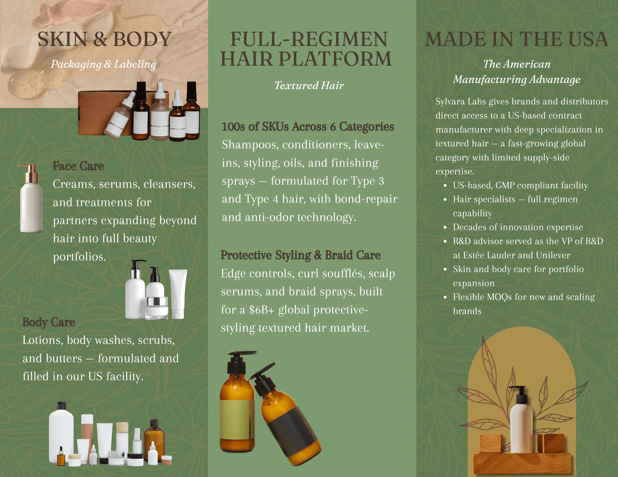 Brochure · outer
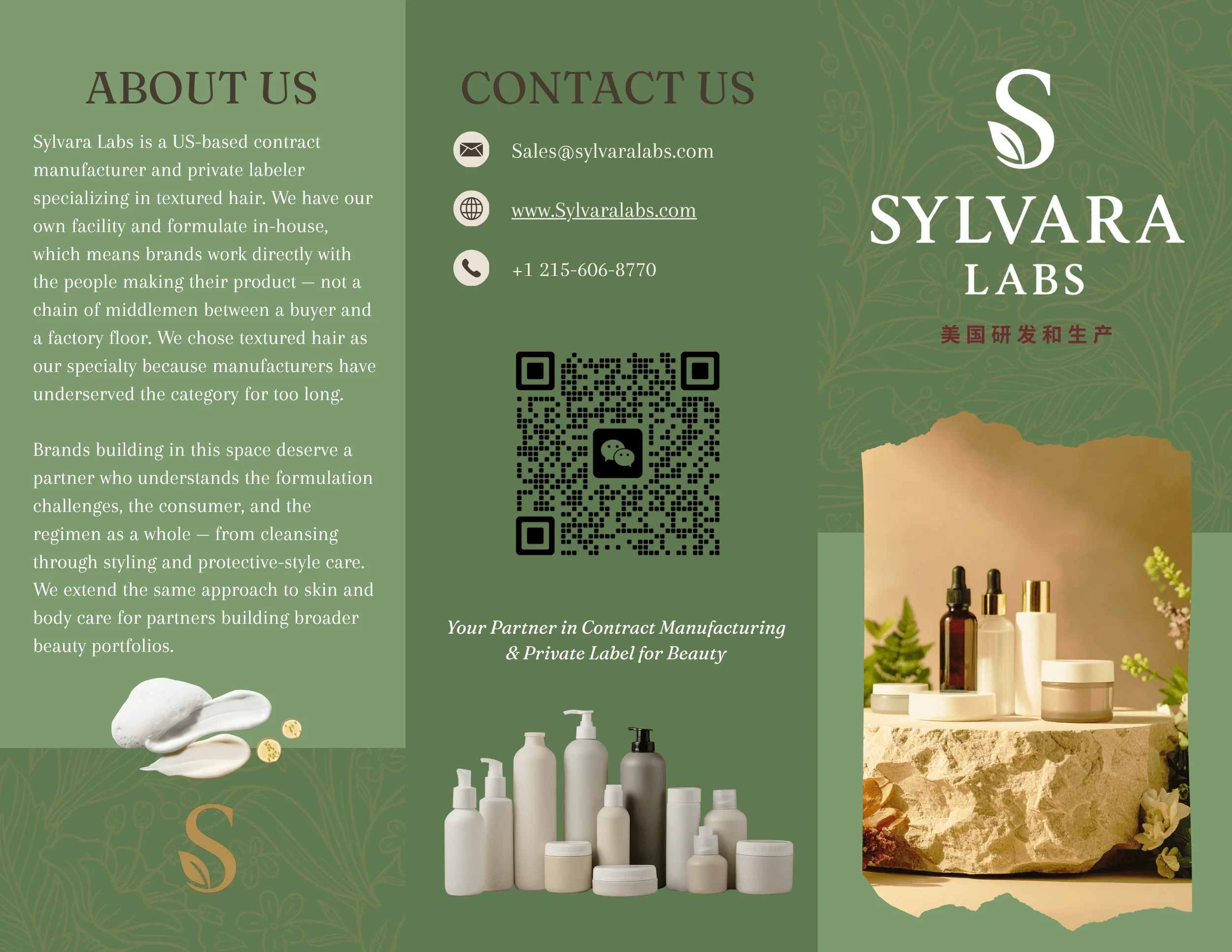 Brochure · inner
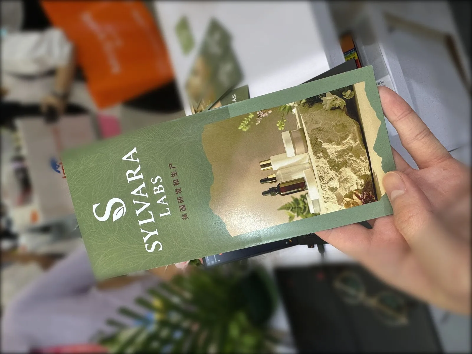 Cover · in hand
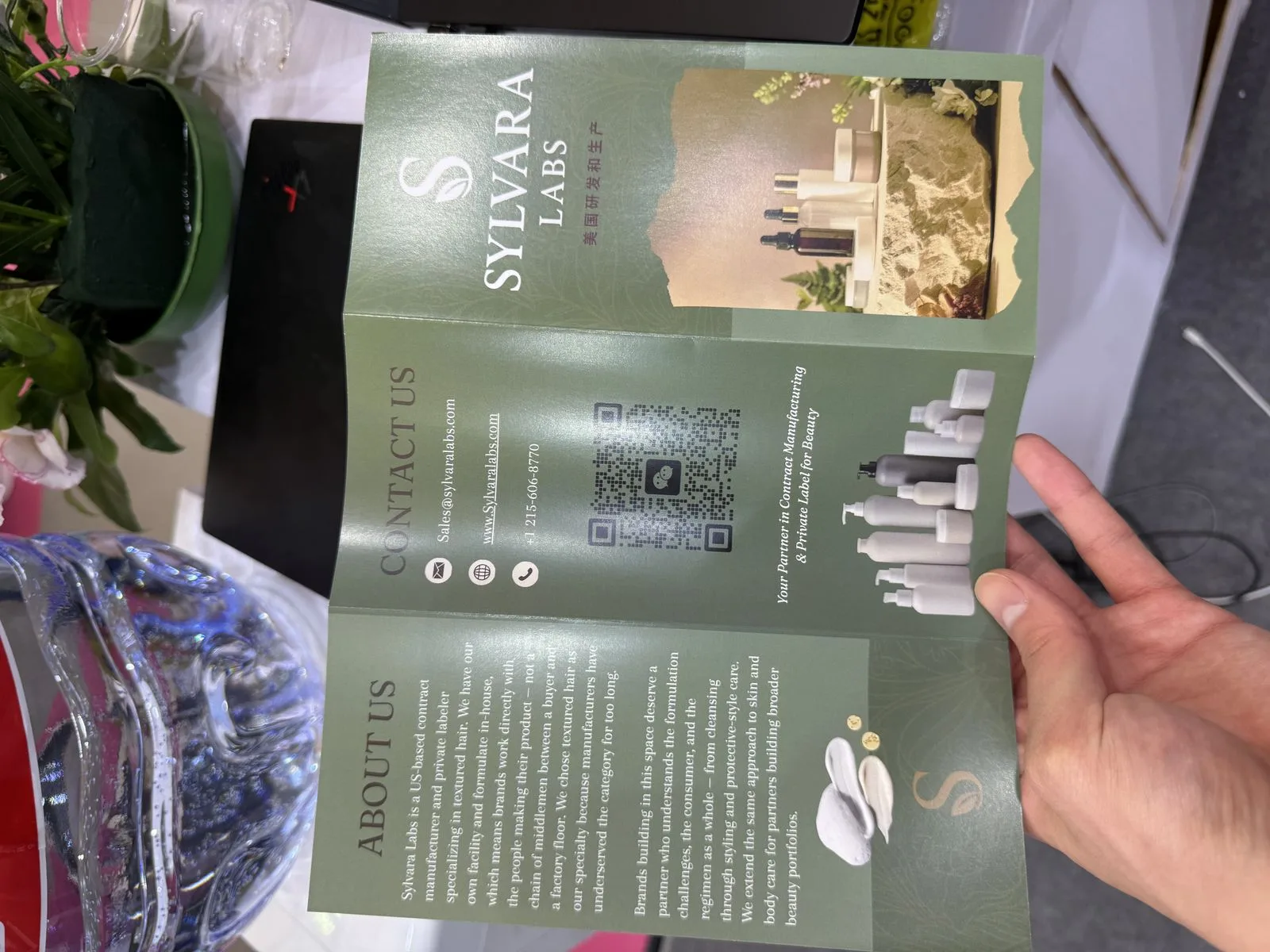 Open · about & contact spread